Basic Criteria for Judging Good and Bad Design
When creating designs or when commissioning a design from a studio and reviewing it, you need to judge whether the design is good or bad.
This is an unavoidable theme when learning design.
To serve as a reference, in this article I will explain the basic criteria for good and bad design from my perspective.
There are truly many kinds of design.
In this article I hope to explain a way of thinking that can be applied as generically as possible.
Note: This article does not cover specific criteria for things like websites or logos.
Basic Concepts of Good Design vs. Bad Design
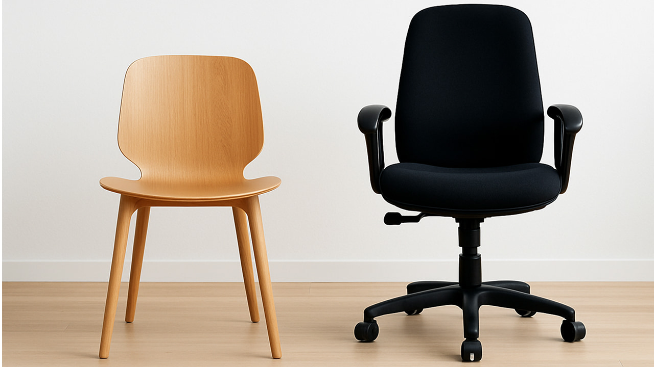
For example, would you say these two chair designs are good design or bad design?
 Two chairs
It’s difficult to judge, isn’t it?
That’s because it depends on the purpose and the user.
The wooden chair on the left may be a good design for a wood‑themed room or office, but for someone who plays video games for hours it might become painful to sit on.
The office chair on the right may be well designed for an office, but it might not be a good fit for a wedding venue.
As discussed in Design Definition & Purpose, design is done to achieve a specific goal, so the fundamental idea is that good or bad design judgments change depending on the purpose and the user.
This way of thinking applies equally to chair design, website design, banner design, and so on.
In other words, to judge good vs. bad design, it’s important to be clear about what the design is for and who it is intended for.
Characteristics of Good Design vs. Bad Design
Building on the basic concept, let’s look at the characteristics of good design and bad design.
These characteristics aren’t tied to any one type of design—they can be applied broadly.
Functionality
| Good Design | Bad Design |
|---|---|
| Fulfills its intended purpose | Fails to fulfill its purpose |
| Includes all necessary features | Lacks essential features |
| Intuitive to operate | Difficult to understand how to use |
Aesthetics
| Good Design | Bad Design |
|---|---|
| Has visual harmony | Lacks visual harmony |
| Well balanced | Poorly balanced |
| Feels contemporary | Feels outdated |
Usability
| Good Design | Bad Design |
|---|---|
| Intuitive to use | Users don’t know how to use it |
| Low learning curve | High learning curve |
Accessibility
| Good Design | Bad Design |
|---|---|
| Usable by everyone | Usable only by some people |
| Considers color‑vision deficiencies | Ignores color‑vision deficiencies |
Consistency
| Good Design | Bad Design |
|---|---|
| Unified design rules | Inconsistent design rules |
| Identical elements look the same | Identical elements look different |
| Consistent brand image | Inconsistent brand image |
It’s important to evaluate design objectively, not subjectively.
Rather than “I like it” or “I don’t,” use the above characteristics as a reference!
So far we’ve covered principles that apply to any kind of design.
From here, it’s best to dive deeper based on specific criteria for each design domain.
Common Design Mistakes
Finally, here are some mistakes often made when creating designs.
Sometimes they’re intentional, but in other cases it’s important to recognize them:
- Focusing only on appearance
- Beautiful but hard‑to‑use designs
- Designs that ignore functionality
- Chasing trends
- Forcing in trendy styles
- Designs that don’t fit the brand
- Ignoring the user
- Deciding based only on designer preference
- Not listening to user feedback
- Ignoring consistency
- Different designs on each page
- Lack of visual cohesion
These are common, so keep them in mind not just when creating designs but also when evaluating them.
Summary
Here’s a recap of this article:
- The fundamental idea is that good or bad design judgments change depending on the purpose and the user
- It’s important to consider the five characteristics: functionality, aesthetics, usability, accessibility, and consistency
- Recognize common mistakes to avoid